

First 5 seconds
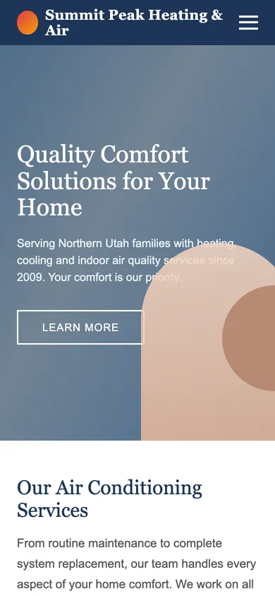
Big blurry photo, a headline about 'comfort solutions' and a 'Learn More' button. I don't see a phone number or anything that says they can come today. I'm already reaching for the back button.
Scores by dimension
| First Impression | 70 of 100 |
|---|---|
| Relevance | 30 of 100 |
| Clarity | 60 of 100 |
| Trust & Credibility | 60 of 100 |
| Motivation & Value | 30 of 100 |
| Objection Handling | 60 of 100 |
| Friction | 30 of 100 |
| CTA & Next Step | 30 of 100 |
Conversion likelihood ~31% (estimate)
Their walk-through
I tapped the ad because it said AC repair, but the page opens on 'Quality Comfort Solutions for Your Home' — that could be any company in any state. I scroll looking for a phone number and only find a hamburger menu. The 'Learn More' button takes me to a list of services I already know I need. There's nothing that says same-day, nothing about what a visit costs, and no stars or review count to tell me they're legit. I do like that they mention all makes and models, and 'since 2009' tells me they're not fly-by-night. Then the form wants nine fields and says someone will contact me in one to two business days. My house is 88 degrees. I'd rather call the next ad that shows a big green call button and 'technicians available today.'
“I need someone today and this page never tells me they can come.”
Where they'd leave
At the form header — '1–2 business days' tells me they can't help today, so I go back to Google.
Findings (7)
- CriticalCTA & Next Step
No way to call from the mobile hero
The only CTA above the fold is 'Learn More', and the phone number isn't visible or tappable on mobile.
“Where's the phone number? I need someone today.”
- HighRelevance
Headline doesn't match what I searched
The H1 is generic and doesn't mention AC repair, location, or speed.
“I searched AC repair. This says 'comfort solutions'?”
- HighCTA & Next Step
'Learn More' is vague and low-contrast
The primary CTA is a ghost button labeled 'Learn More' that doesn't start a conversion.
“Learn more? I want to BOOK.”
- HighFriction
No persistent call option on mobile
After the hero there is no visible way to call on mobile.
“I scrolled and lost any way to call.”
- HighMotivation & Value
Response time is too slow
'1–2 business days' tells urgent visitors to go elsewhere.
“1–2 business days? It's 95 degrees in here.”
- MediumFriction
Hero loads slowly on mobile (LCP 4.8s)
The hero image is the LCP element and takes 4.8s on a throttled mobile connection.
“It's still loading and I'm already annoyed.”
- MediumFriction
Full site nav creates exits
Eight nav links compete with the conversion goal.
“Too many links. I just want to call.”
Fixes that help Emergency Eric
- 1Put a click-to-call button and 'Same-day AC repair' in the mobile heroCriticalQuick winCTAEst. lift: +3.2–9.5% (estimate)
- 2Rewrite the hero headline to say what you do, where, and how fastHighQuick winHeadline & messagingEst. lift: +1.9–7.4% (estimate)
- 3Change the 'Learn More' button to an action-specific CTAHighQuick winCTAEst. lift: +1.8–5.4% (estimate)
- 4Add a sticky tap-to-call bar on mobileHighQuick winMobile UXEst. lift: +1.6–6.6% (estimate)
- 6Promise a faster response than '1–2 business days'HighQuick winOfferEst. lift: +2.7–8% (estimate)
- 7Compress hero image — mobile LCP is 4.8sMediumQuick winSpeed & performanceEst. lift: +0.6–2.8% (estimate)
- 9Trim the 8-link nav on this landing page to logo + phoneMediumQuick winNavigationEst. lift: +0.3–1.3% (estimate)